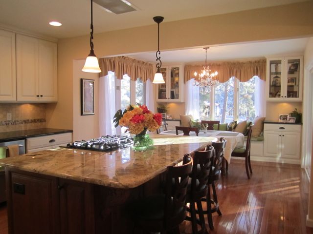
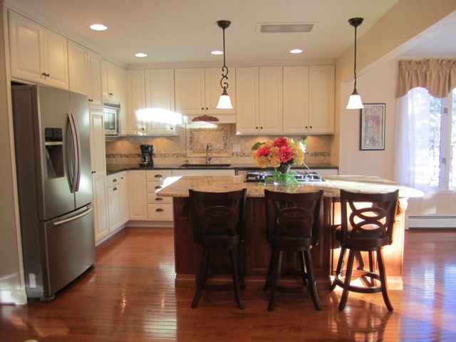
Photo 1 – Walking into the Kitchen
This is our new kitchen. We went from white tile floors, dark oak cabinetry, low-hanging soffits, and baby-blue countertops to a completely updated kitchen complete with hardwood floors, granite countertops, solid cherry and maple cabinetry, stainless steel appliances, new lighting, and custom touches from the corbels to the window seat.
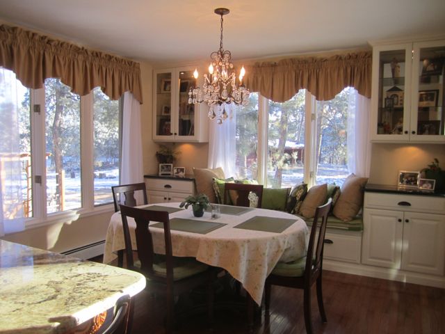
Photo 2 – Breakfast Area
This is our new breakfast area. To truly appreciate the change, please scroll to the the photos towards the end to see the “before” pictures. This breakfast area is surrounded by natural light. Everything is new. The oil-rubbed bronze chandelier adds glamour to a once plain space. The window seat has three highly-functional drawers for storage at the base and the cushions and pillows were handmade.
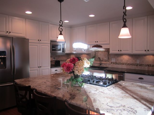
Photo 3 – Standing at Microwave Looking Out
A view from the other side of the kitchen. This is your view if you are standing at the kitchen sink. The gas stove is the only appliance that survived the remodel. It is GE Profile TrueTemp Convection oven with four gas burners. It works perfectly.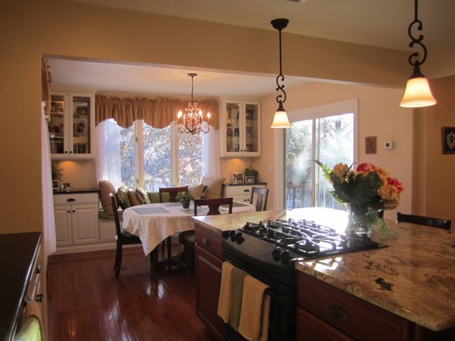
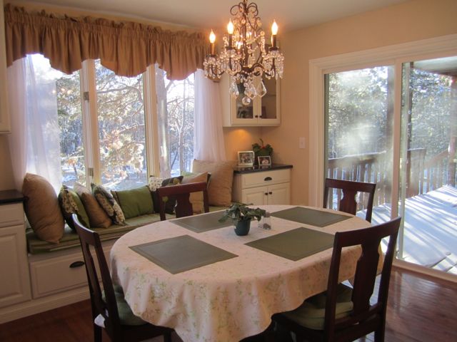
Photo 4 – Breakfast Area Remodel – Lots of Seating
From this view you can see the new upper cabinets where previously there were none. The cabinet interiors are backed with a mirror and are lit from the inside using a halogen task light. The countertops are Labrador Black. The crystal oil-rubbed bronze chandelier is from Lamps Plus and the window dressing is from JC Penny. The cushion was hand-made and the fabric is from Jo-Ann Fabrics.
Photo 5 – From the Sliding Glass Door – Looking over the Island
In the old kitchen the cabinets were hung beneath a soffit that served only to house two broken can lights. Our contractor removed the soffits and we were able to install 39″ cabinets and a 3″ crown moulding. The cabinets are by Diamond and include pull-out shelves and soft-close hinges. The can-lighting in the ceiling, the pendants, and the task lighting are updates as well.
This granite is called Nutono Boudreaux. It has warm tones of beige and tan as well as black and cream. It has lots of movement and is very beautiful. I highly recommend picking out the slab you want before you have it installed. There was tremendous deviation in this stone, some slabs had a urine-like color mixed in with browns and tans. When selecting granite you want to be hands-on.
Photo 6 – Looking at the Kitchen from the Dining Room
This is a view of the kitchen that was impossible before. As a part of this remodel, we had our contractor remove the wall between the dining room and kitchen. This has had a dramatic impact on the usability of the space. Now the kitchen opens to the dining room and the breakfast area creating a much more inclusive “great room” feel. It is perfect for entertaining.
Another detail I feel I need to mention is the ventilation system – we found an exhaust for the stovetop that is made by Braun. It’s a commercial exhaust. We highly recommend it. We didn’t want to block the view with a hood and the exhaust is 1/3 rd the cost. We purchased all our appliances at Lowes. The refrigerator is by SAMSUNG, the dishwasher is Maytag, and the microwave by Sharp. Functionality was very important to us. Even though our appliances are different brands we do not feel we sacrificed design or beauty with our decisions.
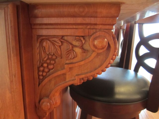
Photo 7 – Corbel Cherry Wood from Osbourne
This corbel is made of cherry wood. I opted to purchase this online from Osbourne Wood Products at a fraction of the cost of the cabinet manufacturer. Shermin-Williams matched the stain. I recommend this to anyone trying to save money on their remodel. We couldn’t be happier with it’s appearance and functionality.
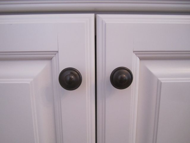
Photo 8 – White Cabinets with Bronze Knobs
I selected two cabinet tones for the kitchen. For the L-shaped counter I opted for cabinets painted in a creamy white and for the island I selected a warm cherry. I love the way the island looks like a piece of furniture in the room. These are the oil-rubbed bronze knobs and you can see some of the detail on the raised panel doors. Our cabinets are full-overlay.
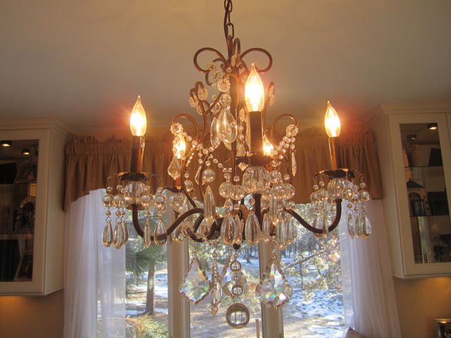
Photo 9 – Bronze Chandelier
I was inspired to use a chandelier in my design by Candice Olsen. I love how it brings elegance to a casual space. I spent approximately 80 hours planning, designing, and sourcing materials for this kitchen. It was well worth it to me. I am so thrilled with the results.
Photo 10 – Sink and Backsplash
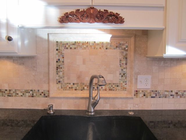
This is the backsplash behind our granite kitchen sink. The field is of travertine from Lowes and the accent tile is Hirsch Glass that can be purchased from CAPCO tile. The center of the frame is laid out in a tile pattern known as “venetian”. The faucet is superb. It is from Delta and is in a brushed nickel finish.
Photo 11 – Backsplash Tile
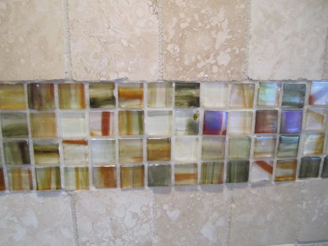
This is an up-close view of the Hirsch glass. I fell in love with this tile right away. It reminds me of old Coca-Cola bottles in a classy kind of way.
Photo 12 – Breakfast Area Bench Seat
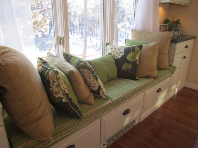
This is everyone’s favorite seat when they come to visit. Below the middle drawer you can see the toe-kick heater we installed to replace the radiant heater we used to have in this space. Even when it is 18 degrees outside our kitchen feels warm.
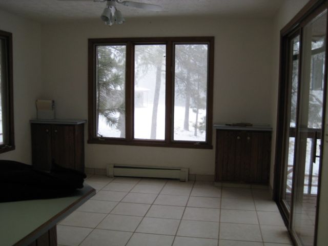
Photo 13 – Old Kitchen view from Breakfast Area
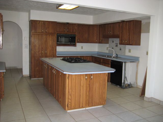
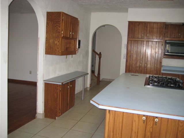
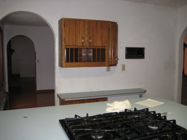
When we first purchased the house the floor was white tile. The cabinets were a dark oak and the countertops were baby blue. There were burn marks on the counters. The fridge was missing and the dishwasher did not work; it actually threw sediment on the dishes making them harder to clean by hand. There was a box light on the ceiling which gave off very poor light. The soffits were useless; they housed two broken can lights.
Photo 14 – Wall to Dining Room that we had Removed
The cabinets on the far left of this photo are mounted on the wall that we had removed.
Photo 15 – Looking into Dining Room from Kitchen
Again, another view of the wall that we had removed. Here you can get a glimpse of the only thing that survived the remodel – our gas stove.
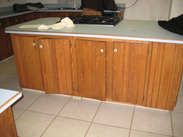
Photo 16 Kitchen Island Cabinets
The previous cabinets were a dark oak, partial-overlay with brass knobs coated with white paint.
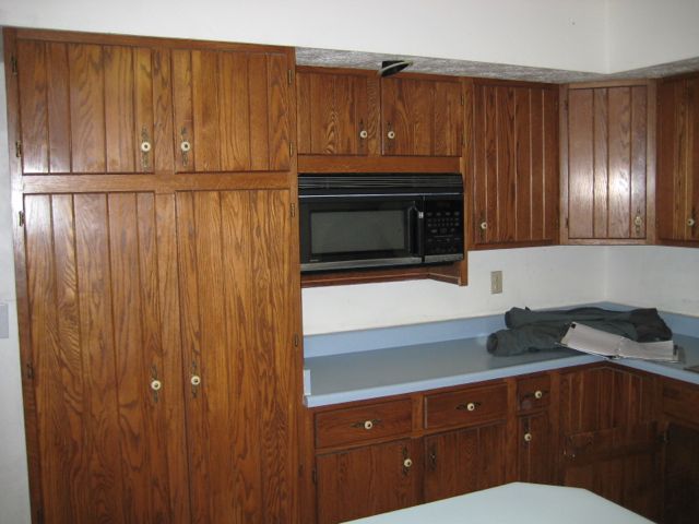
Photo 17 – Looking at Microwave
To open more counter space by the stove, we moved the new fridge to the left of the pantry and slid the pantry and microwave to the right. This improved functionality of the kitchen and made it safer. Now when I’m cooking on the gas burners I don’t have to worry about someone getting something out of the fridge behind me.
Photo 18 – Looking into Old Breakfast Area prior to Kitchen Remodel
This is a picture of the breakfast area before the remodel. It had a dark almost tavern-like feel. The new bench seat, hardwood floors, and creamy-white cabinetry really improve the beauty of the space. It is the most used room of our home now.
I captured some of the comment history from the “Rate My Space” web site on HGTV.com.
Comment from: diggy1
What a beautiful job. I was wondering How the exhaust fan is working for you. Isn’t it to far away from the stove top? I love your kitchen so much I want to do the same thing but Im afraid the exhaust won’t work right. Did you get the exhaust from Loews also?
Response:
The exhaust/ventilator is made by Broan. I can’t remember which of the two models we purchased but it’s either the L400K or the L500K Losone Select Ventilator ceiling/wall mount 120V. It was less than $400. It’s quiet and very effective. In fact, when it’s hot in the summer we use it almost like an attic fan to cool the kitchen (we do not have ac). I find the Broan website a bit difficult to navigate but they have a wonderful technical team that answered all my questions and made the right recommendation for our kitchen. Best wishes to you in your kitchen remodel.
Comment from: Melrose 80
What a wonderful job you’ve done with this space. The sunlight you now get is the icing on the cake. The window seat and that wall are terrific. Okay, I’d personally prefer to see the valances done in that print fabric you have on the pillows, but that’s just me, and I have to agree that you don’t need both cloth and placemats, just one. Even so, it’s a gorgeous space. Congrats.
Response:
Thanks for the compliments! I have two young boys so when they are on the window seat the pillows come in handy. I put the pillows on the floor just in case anyone rolls off the window seat. And I cook enough to serve breakfast, lunch and dinner every day so the placemats are high on functionality for our family. It’s so amazing to be cooking in this beautifully transformed space. I thank the good Lord and my husband for all the support in this remodel. And thank you for your kind words and ranking.
Comment From: Socks without Partners
I like the soothing colors. The valances with sheers are very pretty. I would have to have some kind of privacy curtain option for the patio doors. The place mats are not needed on top of that pretty table cloth. There are way to many pillows on the window seat. All in all i think the room does deserve a 5.
Response:
Thank you so much! Your comments made my day!
Kitchen Remodel Ranking and Results
Blog / Facebook / Pinterest / Twitter /Google + / Bloglovin’/ Instagram
P.S. – I blog to encourage moms, offer free preschool tools, and share ideas for family fun. If you enjoy free recipes, printables, crafts and games for little ones, ideas for family fun and encouraging posts for moms, sign up and have Happy and Blessed Home delivered to your inbox. Simply enter your e-mail address here:
Thanks for being a fan! Do you have a board for home decor or remodeling on Pinterest? Help spread the word and PIN this post on Pinterest!
